I'm an enthusiastic Carb Manager user who has relied on the app for years to diligently track my nutrition and calorie intake. While I hold a genuine appreciation for the application, I believe there is room for enhancement. In this post, which I hope will be the start of a series (as I frequently engage in such optimizations), I aim to introduce the improvements I've implemented successfully. My hope is that the Carb Manager team will find these enhancements inspiring and, who knows, perhaps they will consider incorporating them into the app.
The Layout
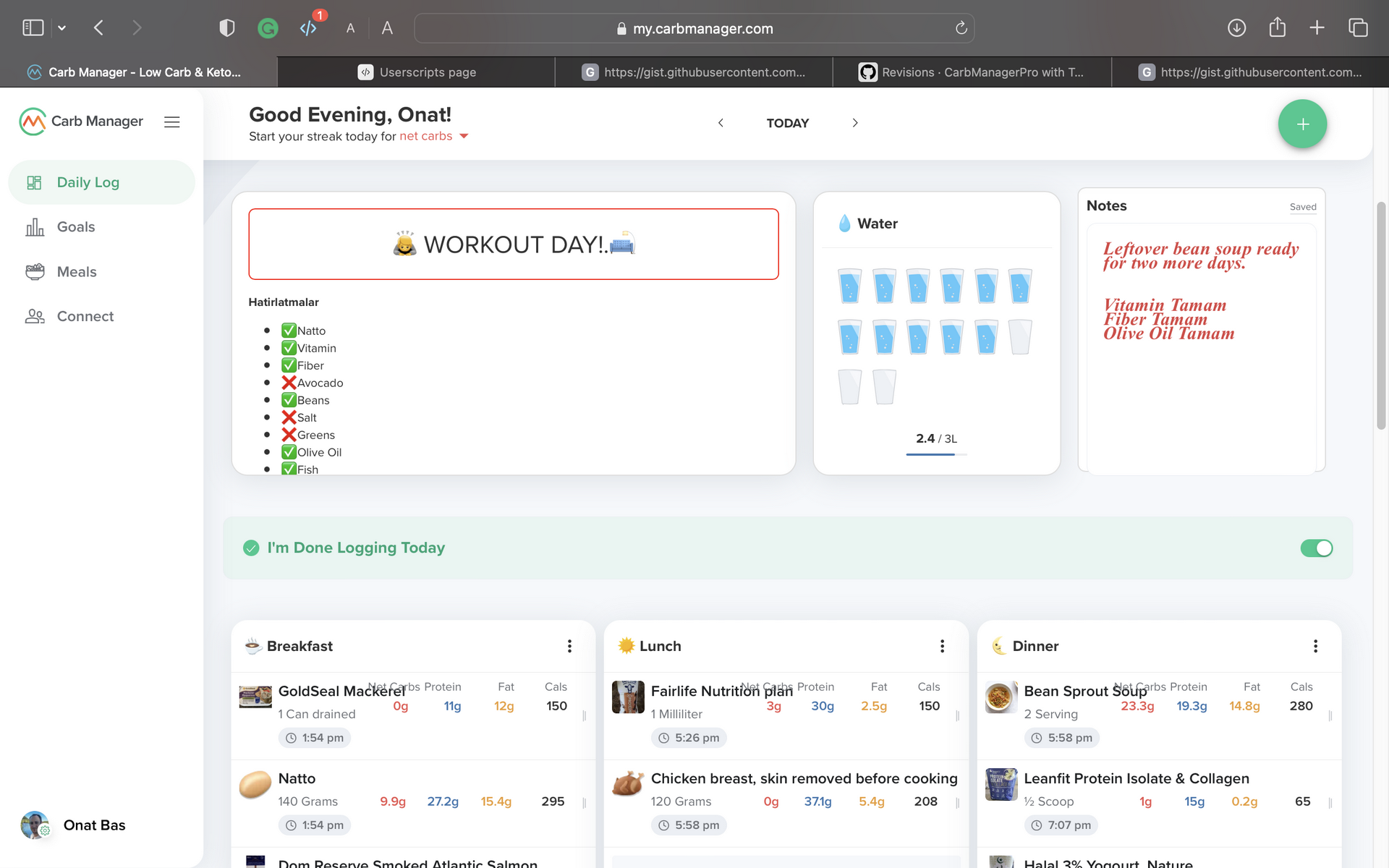
Let's begin by examining the initial landing page of the desktop app. Since I use the web interface extensively—approximately 50% of the time—it is crucial to ensure efficient utilization and eliminate redundancies. Let's delve into the first section.
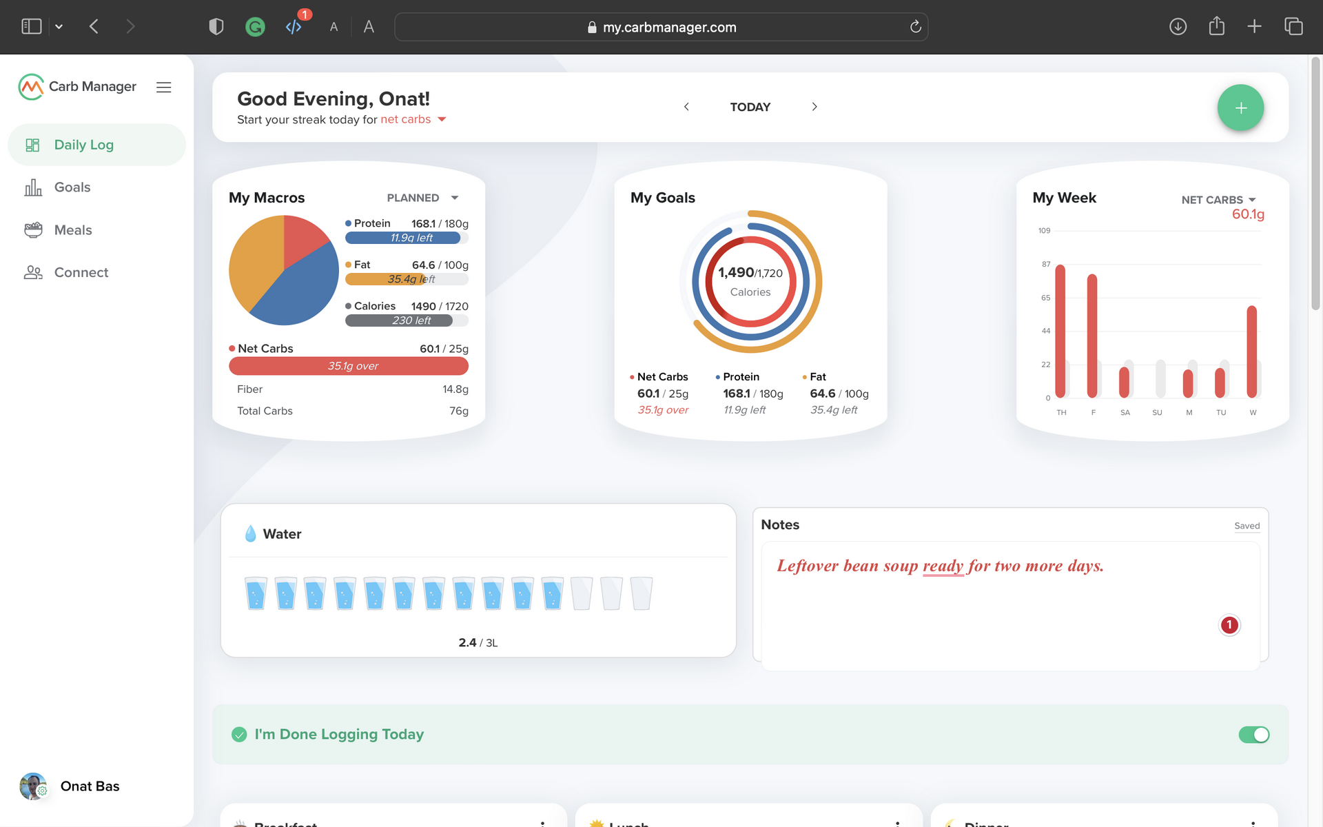
The Notes
Two key aspects immediately stand out. Firstly, I believe that "The Notes" feature is significantly underrepresented in the user interface. I frequently use Notes to jot down meal-prep ideas, make notes about leftover ingredients for the next day, and even plan my meals for multiple days or weeks in advance. Consequently, I sometimes find myself adding notes to dates far into the future to serve as reminders.
See what I did there?
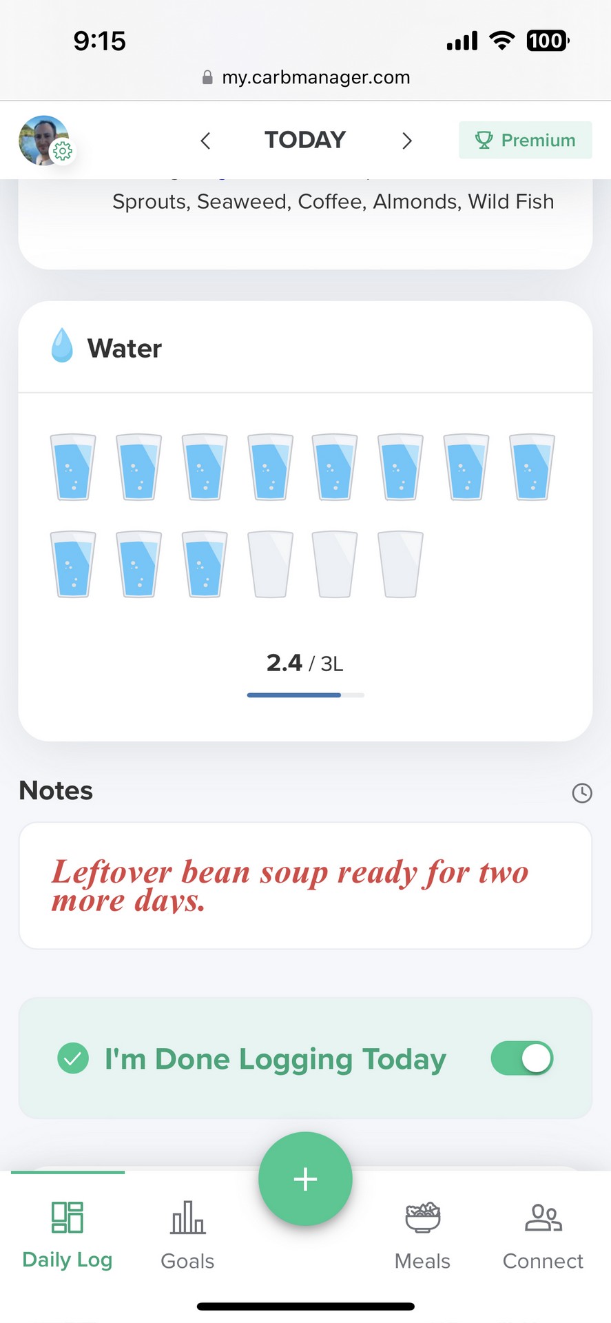
Water Consumption
The second improvement involves the Water feature. I've elevated its prominence because I want the option to log my water intake as swiftly as possible. You'll notice that these adjustments have also been applied to the mobile interface.
My Macros
I want to touch upon specific default settings within the application. The "My Macros" pie chart, by default, displays "Actual" macros instead of "Planned" ones. This essentially duplicates the second widget and introduces redundancy. My extension now ensures that the pie chart displays "Planned" macros.
One of the greatest strengths of Carb Manager is the planning. If you want to use the planning feature, it takes a bunch of clicks to get to a more helpful UI; the first step towards that is the "My Macros" chart.
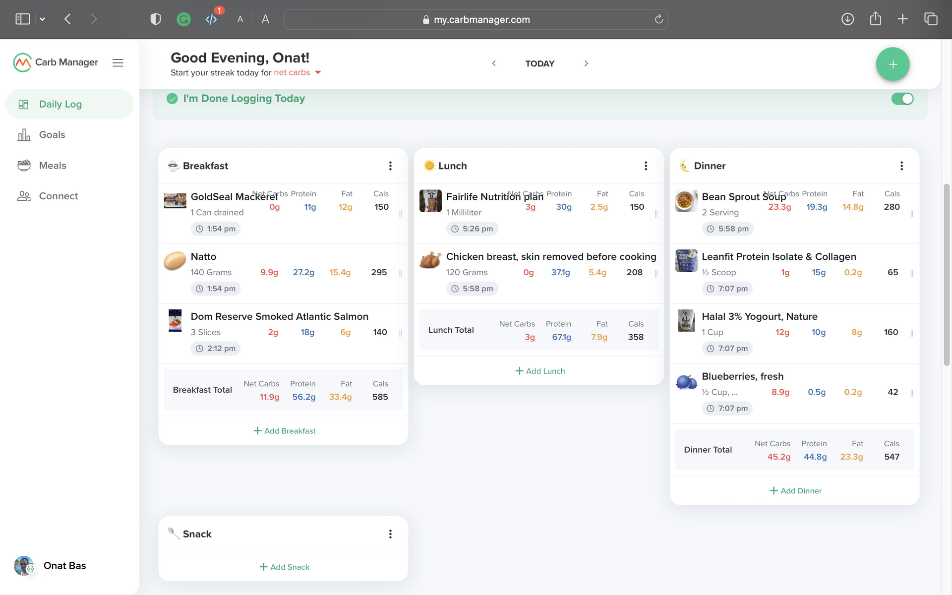
Meals
Instead of listing foods within individual meals, I've organized Breakfast, Lunch, and Dinner into columns. This presents the same information in a more compact format, significantly improving the usability of the drag-and-drop feature during meal planning.
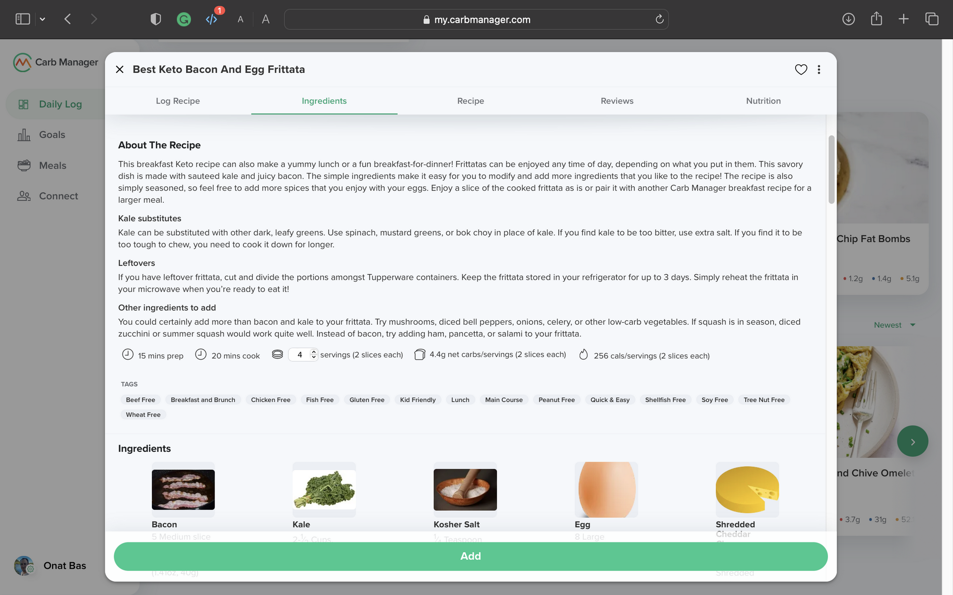
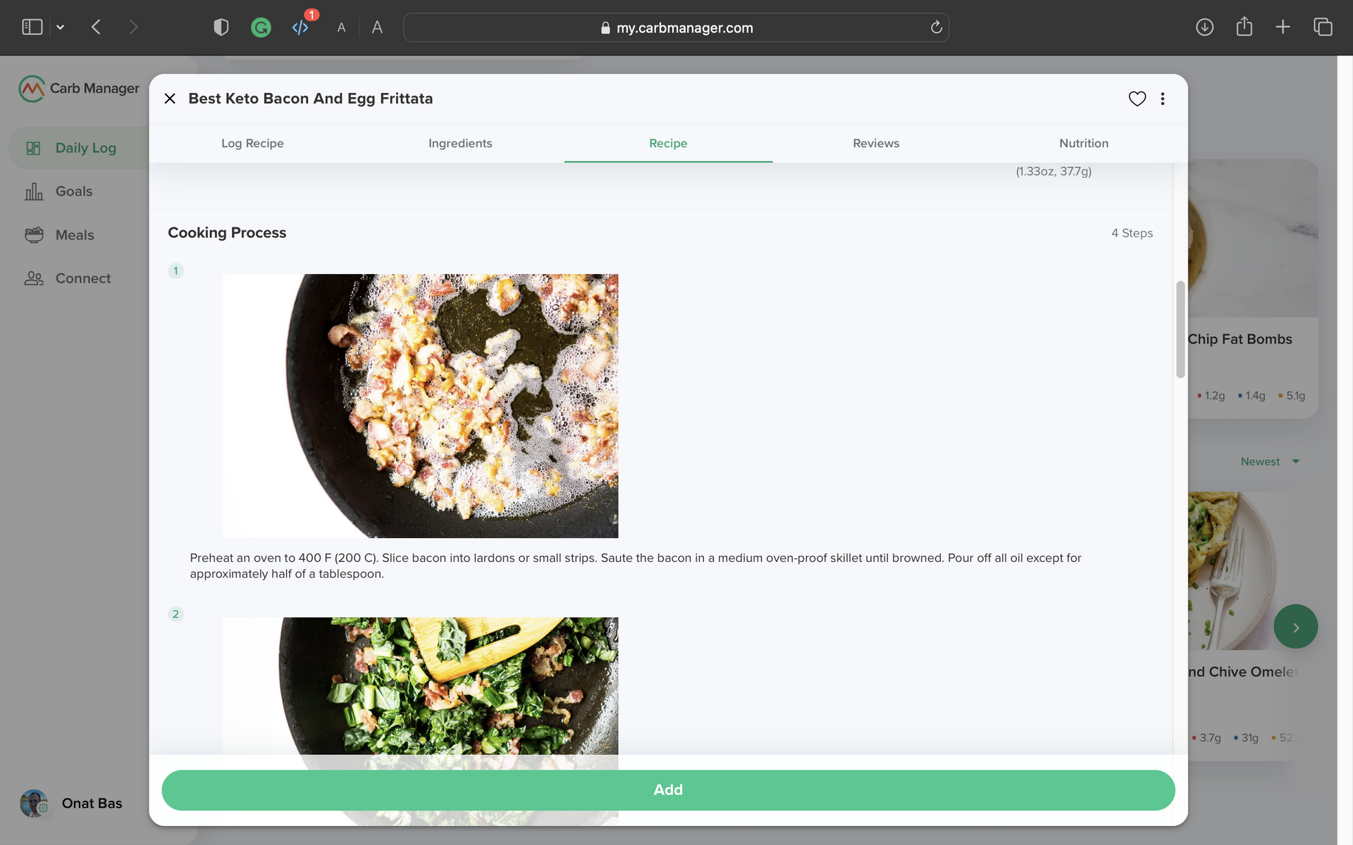
Larger Food Popups
Enlarging the page layout is a no-brainer. The default narrow layout makes text and comments challenging to read and cuts off images.
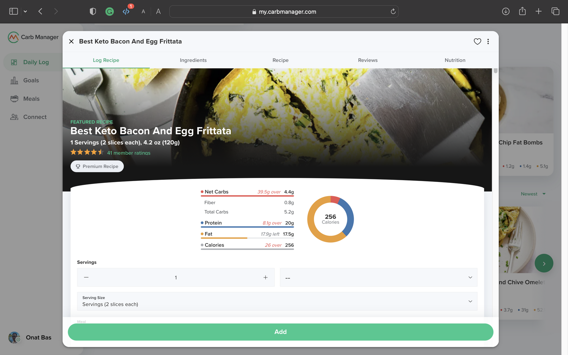
Look at the real estate I'm saving by making the layout larger...
And here, I can see the entire picture: no cuts, no hidden margins. This is a must for the app's usability.
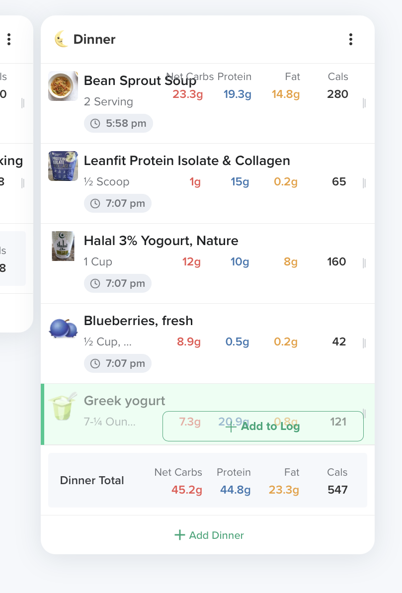
Food Items are "Planned" by default.
One of my modifications involves preventing foods from being added as "actual" items by default. When editing or adding food to my daily log, I prefer them to be added as "Planned" items by default. I've also streamlined the appearance of planned items for a more compact and clear distinction between actual and planned food.
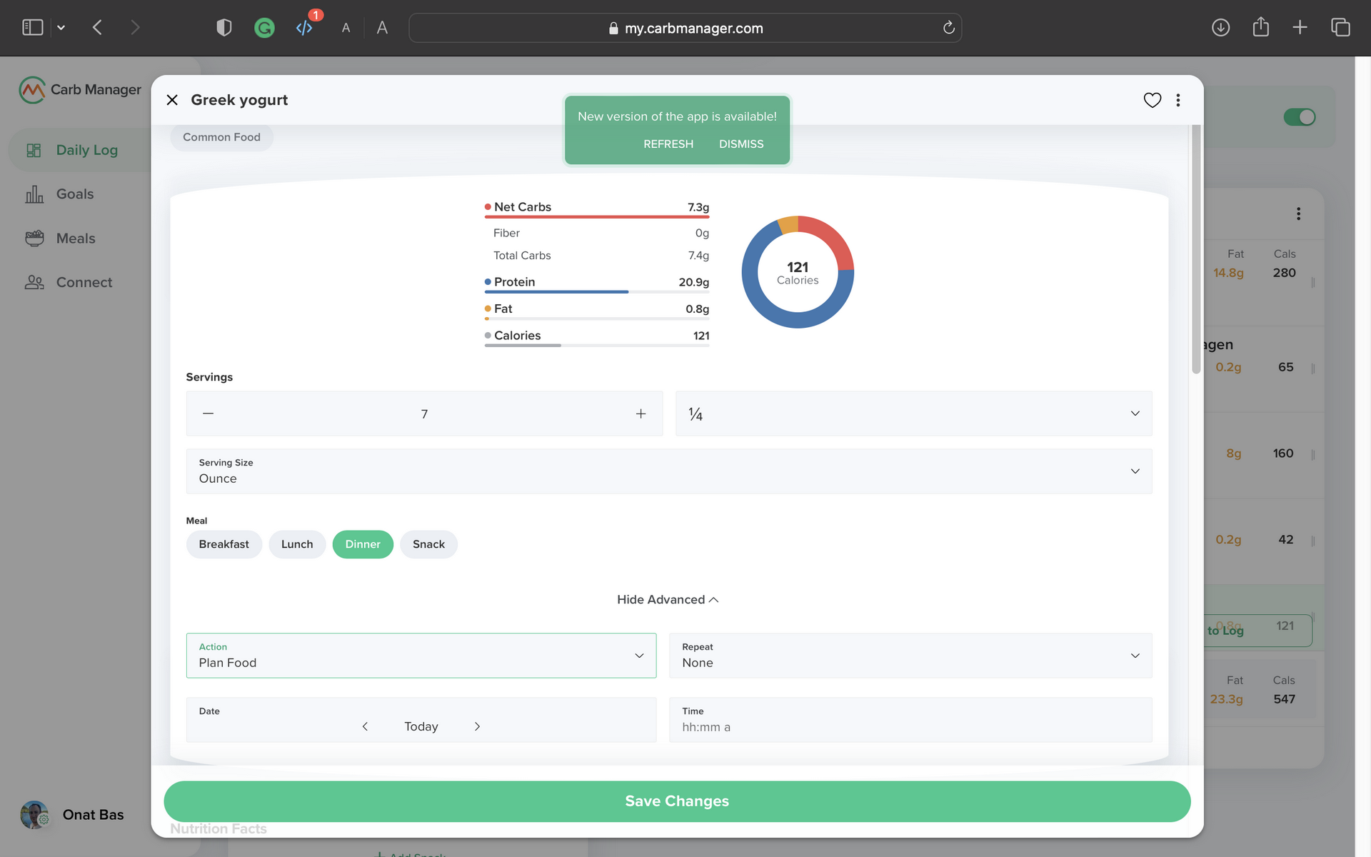
I always remove the time during the addition process since it gets added automatically when I log the food. There's no need for the hour to be added to planned foods; I'll consume them when it suits my schedule.
Some Other Changes
I have additional modifications that I use exclusively in the mobile application or have outgrown. However, for this blog post, I want to share them with you as well.
Reminders/Shortcuts
In the mobile interface, I've created a section that reminds me of foods I want to eat or consume regularly. This feature allows me to access everyday items without repeatedly searching for them. It includes personalized notes (some in Turkish) and direct links to food items. For instance, I can click on "Mixed Nuts" in the widget to add it to a meal. This also applies to specific statistics, such as "Calories" (Kalori) or "Weight" (Kilo), which lead me directly to relevant graphs.
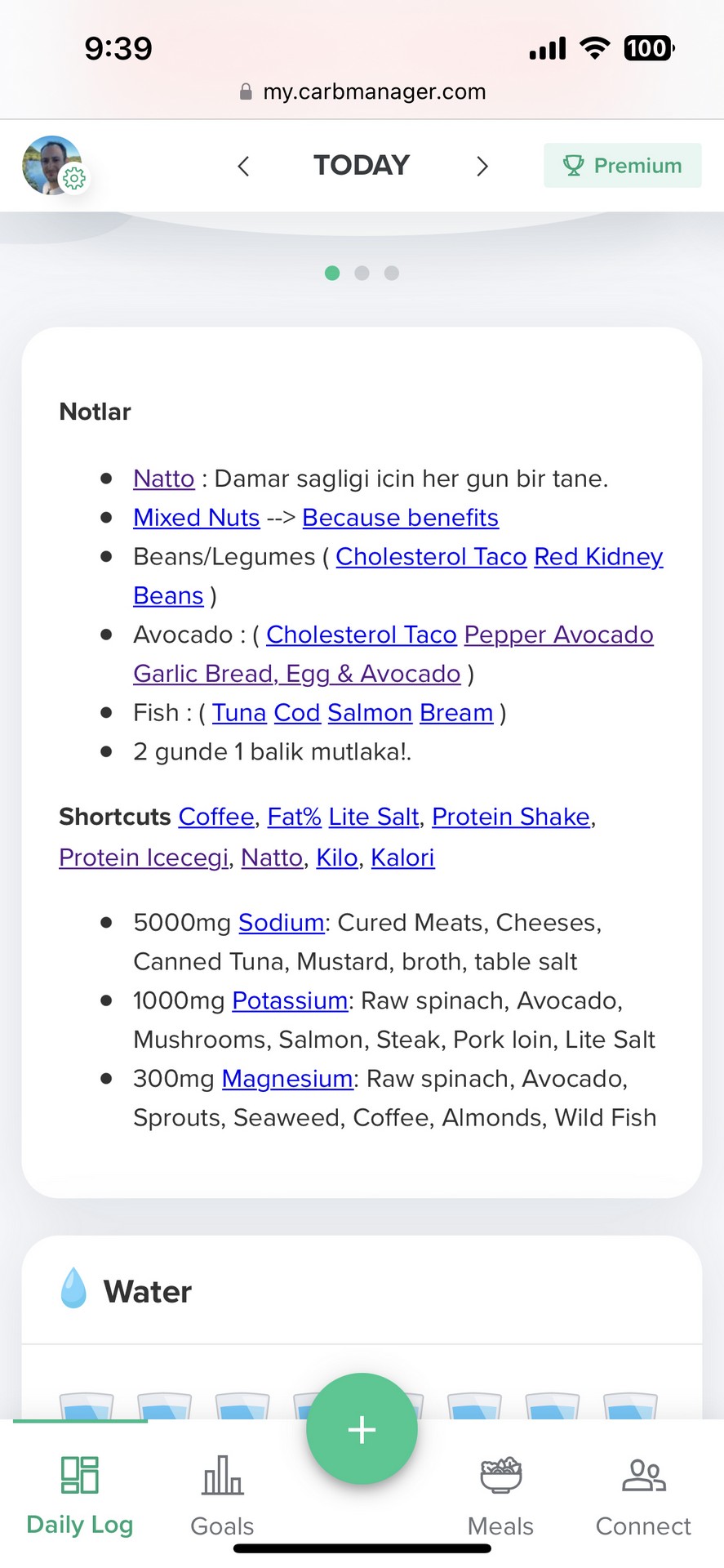
To-Do or To-Eat?
I've maintained a To-Do list for quite some time, listing foods I consider "superfoods" that I aim to incorporate into my diet consistently. This list displays an 'X' for items I haven't consumed that day and a checkmark for those I have. The system detects whether I've finished a food by tracking it in one of my meals. Sometimes, it's not a specific food but a macro, like "fiber." In such cases, I type "Fiber Tamam (Fiber OK in Turkish)," and the system recognizes it similarly. This system helped me stay committed to consuming superfoods until they became a routine part of my diet.
Concluding Thoughts
Some of these adjustments work around premium restrictions. I strongly encourage supporting the developers for this incredible tool. I will share the code in the form of a tampermonkey extension. The purpose of this post again is to inspire the product managers of Carb Manager to think about how a power user could utilize this program for more than just what it is right now. I would love to see the changes incorporated into the application so that others can benefit from this workflow, which I think is very fitting.
Thank you,
Onat